Due to my film being a psychological thriller or something that is somewhat along the lines of this genre, as the person is trapped and has no way of getting out, i decided that the best possible place to base my film would to be to film in it a place which can be related to horror or other psychological film, such as treasure island which is based on an island, which in itself is incapable of being able to escape without authority and a full blown plan. Then the fact that it is based in the middle of the island with high security presents the danger which the protagonist is beginning to get himself into due to nothing that is safe would be protected or hidden away that much.
Therefore this means that i could either base my isolation film in a forest/woods due to they are the typical setting of where a character is trying to escape such as in horrors therefore for the audience they can easily relate to the panic and distress of the persona's dilemma as the scenario is relatable or even recognisable.
However, a typical psychological non escape film is based within a room which the persona cannot escape, such as Saw 1 two men are locked up in a bathroom with only a certain amount of space to move and to escape the room they have to complete certain tasks that saw gives them or he gives them clues towards how they can get out, however the whole suspense to the film is they both do not know how they actually end up there or where they are in general all that they really do know is that they are in a bathroom with a stranger which is the type of film i want to create.
I want to create a film where a person wakes up to be isolated and confused with whats going on, whether or not they are in a dream or whether they are in real life due to them being in a random room/woods with no escape with no memory of how they got there. Of course they would begin to believe that they are in a dream if they have no proof to prove to themselves that it's not? therefore this then leaves the audience uncomfortable and leaves them in suspense as well as leaving them questioning the film a lot thus making them want to watch the rest of the film. Such as wanting to find out whether or not the persona actually does escape, whether or not they find out how they got to the place that they are trapped in or even finding out whether or not it is in fact real life or just a concept of their dreams.
Therefore, to decide where i'm going to film i need to either find a plain room or woods that i can get to be authorized to film in, so from now on in the production process i need to go to both of these kind of places and see which of settings would fit in with my genre of film the best, so that i can produce the best possible short film that i can.
Wednesday, 11 November 2015
Tuesday, 20 October 2015
Planning
I decided to follow through with my idea of the isolation film as the story line is more original and i can gain more experience with the experimenting and different idea's I can get from making this narrative.
Over the half term I hope to have managed to find an actor, a full detailed story line, a mock up film poster and a place I plan to film in.
Over the half term I hope to have managed to find an actor, a full detailed story line, a mock up film poster and a place I plan to film in.
Tuesday, 13 October 2015
Secondary Research
Within this 4 minute clip a youtuber analyses a short film called 2+2=5 directed by Babak Anvari made in 2011 then released online in 2013. He starts with a short synopsis of the whole story which he goes into the deeper level of meaning that the films message is trying to explain as it represents the domination of authority and how it subliminally shows authorities of war within the short film and their roles within their authority, as well as the main message which you can get from it is that the higher authority try to manipulate the lower society by forcing them believe what they want them to think such as changing their knowledge from 4 to 5 which as in society if information was to be changed then the majority would rebel for justice as in the human race we find it hard to accept changes once we already have the facts. He then goes into the detail of the set and how it adds to the message that the director is trying to express as the walls are grey and dull thus making them look like prison walls creating the personas of venerability then the character build up creates a man of high authority and scares the audience due to his power that has been created, as once the rebel student begins to rebel the audience feels scared for him due to they know he won't back down any of his power to a student. He then goes onto explain how the reason in which why the film is so successful is due to the message expressing the problems in social conduct and putting them into a relatable place for the audience so that it is easier for them to engage themselves and relate to the story which i also agree with.
Wednesday, 7 October 2015
Ideas I have so far on narratives
Bad Influences:
- Starts with the representation of the antagonists death/suicide
- Tracks back to meeting new friends/close friends they already have
- Friends influence them into doing illegal substances
- Leads to overdose/being spiked
- Show the lead up to their death
- Show the 'friends' reactions (they don't care, laughing about it, ignore it) Are they true friends?
- Possibly see the after spirit looking over them; was it really worth it?
Isolation:
- Antagonist shown in an isolated room (partly like a mental asylum)
- They keep trying to go towards the door so they can get out
- Every time they get closer to the door they flash back to where they began
- Then someone opens the door and they can walk straight out
- They were in their bedroom the whole time
Wednesday, 30 September 2015
Codes and Conventions of Short Films
Length and Basic Info:
- The normal duration of a short film is around 5-15 minutes long as from what i have seen from the ones that i have analysed, the ones that were most effective were around 5 minutes long due to they got straight to the point thus keeping the audience drawn in the whole way throughout.
- There is usually only main characters not any secondary due to the duration of the film is not long enough to include irrelevant people that the audience do not understand why they were include thus causing confusion.
Concept:
- Everyday situations more casual than a feature film this allows the audience to relate to the film more and be a part of it therefore making the film come across as more realistic and believable.
Budget:
- Usually low budget or no budget at all.
- They normally don't include a soundtrack as it takes too much time off of the film.
- Actors are usually amateurs around the ages of 15-27.
Characters:
- The characters usually range between 2-5; the use of less characters makes it more personal to the audience therefore makes it more effective as there is not enough time to build characters in short films.
- There will only be one protagonist throughout the whole plot.
Twists:
- There will always be a twist to every short film to make it more interesting and plot built.
- Use an everyday situation however add something to it that you wouldn't normally expect to add suspense and curiousity.
- Sometimes keep some of the story (clues) until the end so that it keeps the audience in their seat.
Technical/Reoccurring Themes:
- Usually very basic equipment is used such as an SLR and tripod.
- Voice overs/narrations are typically used to give information to the audience quickly.
- There are usually no wars (such as explosions) or fantasy involved.
Wednesday, 23 September 2015
Summary of Film Posters
From the film posters that I have analysed obviously I will need to include a film title and the persona of my film on my film poster as they are the most significant part of every film poster, i will need to have my persona taking up most of the space on the poster as they are the most important part of it, as for my title every poster is set out differently therefore it will have to come down to where it suits and looks the best when I edit it. The certificate rating does not seem to be too important as it is only shown on 1/10 of the film posters therefore this is one of the things i will not be including on my film poster. A slogan used to catch the audiences attention and to make them think/want to see the film more is used on 4/10 of the film posters I have researched into, thus making it not a compulsory part so i will decide when it comes to editing my film poster whether or not it looks better with or without the slogan. The credits at the bottom of the film poster are used on 7/10 of the film posters i researched into, therefore i decided that it is compulsory that i include this on my film poster. Also the typography of the credits and title are more than always capitalised therefore in my poster both will need to be capitalised.
Tuesday, 22 September 2015
Analysis of Film Posters
A Short Film about Love (Short Film)
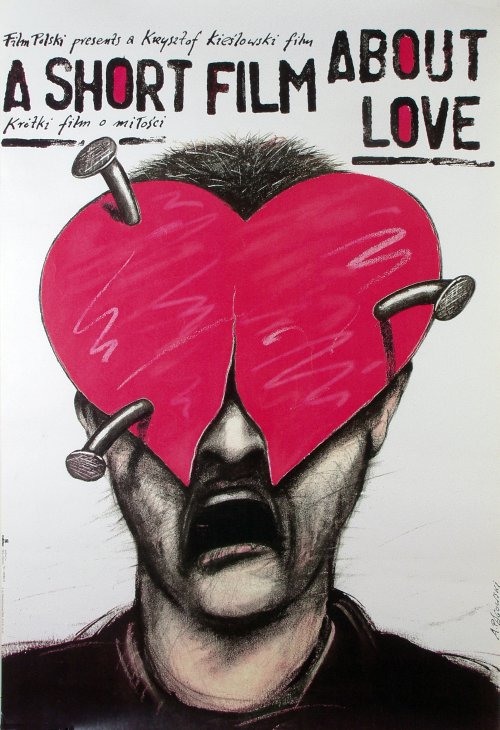 The drawing makes the target audience of teenage girls to middle aged woman curious into who is behind the heart, therefore intriguing them into watching the film so that they can find out the answer to the mystery. As well as love overall is shown to be something significant, overpowering and fantastic however in this film poster it is presented to have destroyed the protagonist, therefore inducing the audience again as they will want to know what has made him distraught from love. The typography itself is quite interesting as it looks handwritten therefore gives off the impression that it is a personal story however the handwritten writing above and below the film title are quite hard to read therefore become irrelevant to the audience as if it is hard to read they won't bother to try and work it out.
The Lost Purge (Short Film)
 This film poster does seem to look quite professional and displayed out in a correct manor as it just seems to look like the producer has tried to make the film look better than it is to draw in their audience as they have put two of the awards that the film was given. However, the typography fits into the genre that the producer is trying to produce therefore makes the film poster seem more interesting. Finally the main picture of the film poster does not seem to tell part of the story or give away anything about what the film could be about therefore the audience are not as indulged into wanting to see the film as they would if they were too see another film poster with what would seem more of a story behind it, however the only message that the audience can get from this film poster is that it is about a young boy. I would say that the target audience of this film would be teenagers to young adults due to it looks like some sort of thriller.
Insomniacs (Short Film)
The typography and the design set out looks professional due to it looks like what a feature film poster would look like thus making it appealing however what seems to be lighting that is over the top of them at the top of the film poster (yellow circles) this is usually used at the start of feature films on screen however on a film poster it just looks like the print hasn't come out well or that they edited the poster badly. However the image presented on the poster fits in well with the film title therefore gives their audience an insight to that the film title is not completely off topic to what the film is about.
 Best Man Wins (Short Film)
The plane that flys over the typography connotes that the main protagonists life will improve throughout the film due to it flying upwards not crashing this then links to the film title as the 'best man wins'. It then looks like the survival of the fittest wins as there is two men having a fight in the kitchen. The typography itself seems quite professional, however the movie title seems to take up most of the film poster which can seem as if the producer did not what else to put there, resulting in it looking unprofessional.
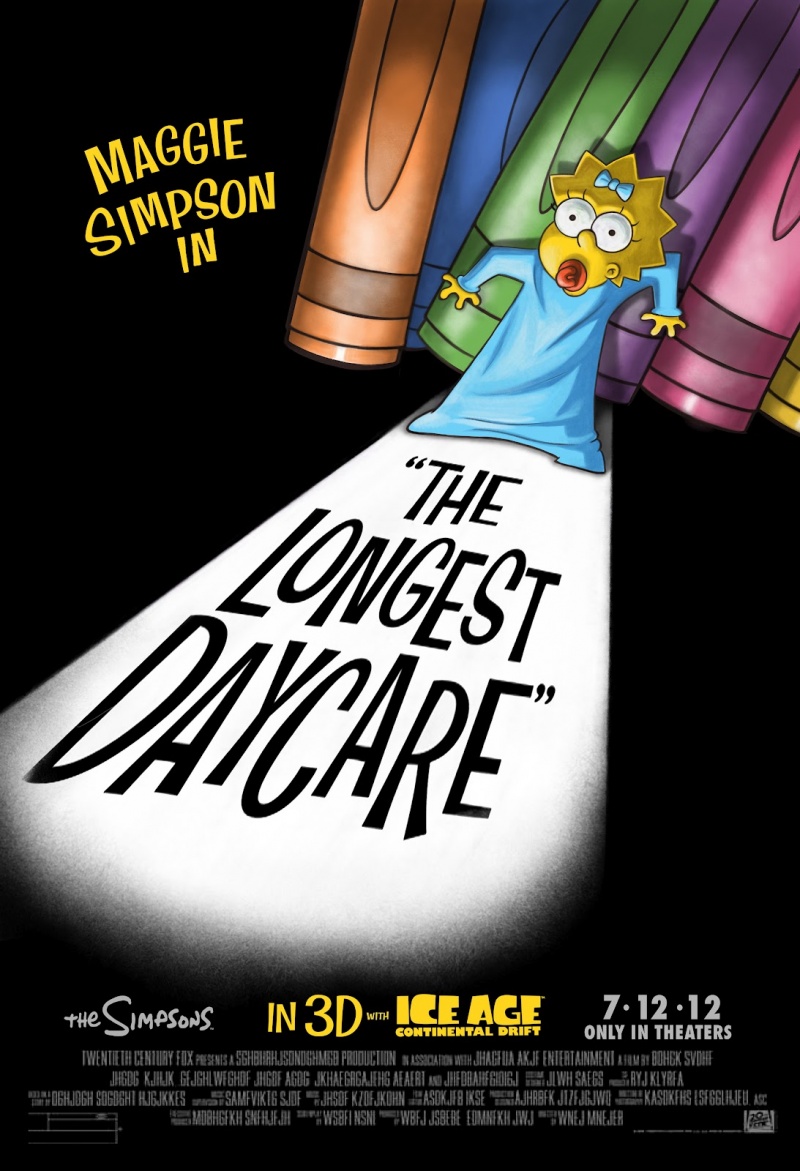 The Longest Daycare (Short Film)
Due to Maggie being a baby you would expect Marge to be on the film poster along with Maggie however due to Maggie being the Protagonist in the film the producer must have thought just to focus on the protagonist of the film to then draw in the audience, as well as the fact that The Simpsons is a very well known and loved show so therefore the characters are much loved along with it therefore for the producer to present one of the characters to be in trouble, especially one of the most vulnerable it automatically draws in the audience due to them wanting to find out the outcome. The way in which the producer presents danger towards Maggie on the film poster in by presenting her as if she is in a horror film, high key lighting to show that she is scared/in shock then low key lighting to hide out everything around her thus creating a sinister atmosphere. The typography is the typical 'The Simpsons' typography that they use on every show which is then recognisable to the audience so that they know it is an official advert not an amateur film.
 2:AM (Short Film)
 The title itself sets the tone of the film because of the vibrant colours and bold typography. This further sets an time and place for the film to take place. This then allows for the audience to understand that time is a key aspect in the film because of both the title and the image below it. The use of colour makes the film poster attratvie and bold while the time frame. The set is based in a retro diner which is further supported by the title as it is neon and fits into the theme of a diner. The slogan presented next to the protagonist creates mystery and then draws in the reader as it is quite a catchy slogan due to it leaves the audience questioning itself.
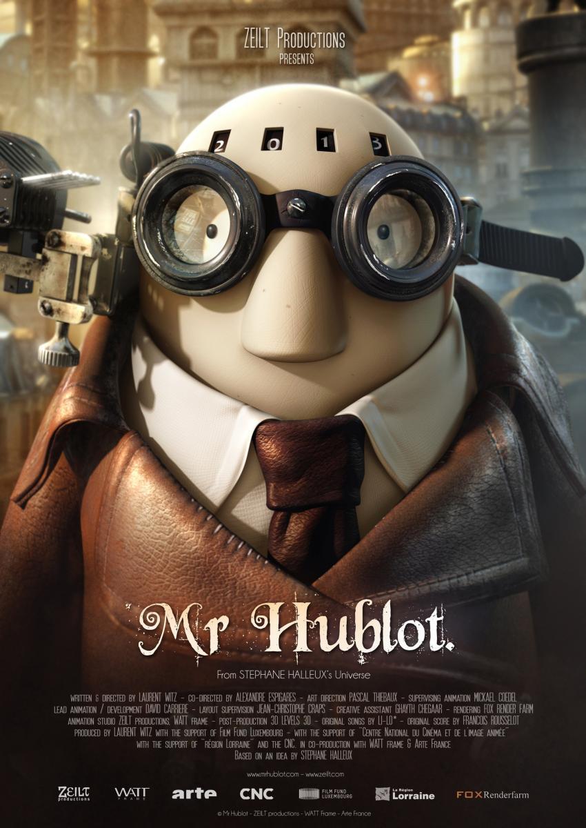 Mr Hublot (Short Film)
The typography that has been used for the movie title creates the sense of mystery due to it is not a typical type of typography and is used on other myserious and fantasy films such as nanny mchpee. The main character is also presented on the film poster which then connects the audience to the story automatically as the character is presented to be for children therefore he seems cute and adorable to the adult audience which then makes the adult audience want to go and see it due to them having a connection of finding the protagonist sweet and adorable.
 Pokemon the movie 2000 (Film)
The target audience for this film poster would be children to teenagers. What makes this film poster so effective and persuasive to watch the film is that it is one of the small amount of posters that i have analysed that includes a slogan, this therefore catches onto the reader and makes the film stick into their head so that they can then look forward and cannot wait to see the film. As well as, they have included most of the characters that are going to be in the film on the poster this means that the audience can see if their favourite character is in it which would then persuade the audience to see it even more.
+DVD.jpg) The Iron Giant (Film)
The Iron Giant (Film)The typography is not an original type therefore creates originality to the film as well as the giant is hidden in the a of giant which further links the character to the title. Although he is presented to be a huge giant and take up most of the space on the film poster he is in a caring position of looking after the little boy which then subverts the conventions of a stereotypical giant to destroy the world. The use of the colour blue then connotes to the audience that he is not from earth as both the sky and the character are blue this is then further supported by the typography being blue.
 The Naughty Room (Film)
Two scenes from the film have been introduced on the film poster which then gives the audience an insight to what the film is about. The high angle used on the bottom scene presents venerability which is then connoted to their slogan as he is about to experience one of the circumstances for whatever reason he needs to. The colour of the typography is quite bright and colourful which then connotes to the audience that the film isn't completely serious and that the genre is a comedy as well as the scenes presented from the film look quite funny and comedy like.
Subscribe to:
Posts (Atom)