Wednesday 30 September 2015

Codes and Conventions of Short Films


Length and Basic Info:
  • The normal duration of a short film is around 5-15 minutes long as from what i have seen from the ones that i have analysed, the ones that were most effective were around 5 minutes long due to they got straight to the point thus keeping the audience drawn in the whole way throughout. 
  • There is usually only main characters not any secondary due to the duration of the film is not long enough to include irrelevant people that the audience do not understand why they were include thus causing confusion. 
Concept:
  • Everyday situations more casual than a feature film this allows the audience to relate to the film more and be a part of it therefore making the film come across as more realistic and believable.
Budget:
  • Usually low budget or no budget at all.
  • They normally don't include a soundtrack as it takes too much time off of the film.
  • Actors are usually amateurs around the ages of 15-27.
Characters:
  • The characters usually range between 2-5; the use of less characters makes it more personal to the audience therefore makes it more effective as there is not enough time to build characters in short films.
  • There will only be one protagonist throughout the whole plot.
Twists:
  • There will always be a twist to every short film to make it more interesting and plot built.
  • Use an everyday situation however add something to it that you wouldn't normally expect to add suspense and curiousity.
  • Sometimes keep some of the story (clues) until the end so that it keeps the audience in their seat.
Technical/Reoccurring Themes:
  • Usually very basic equipment is used such as an SLR and tripod.
  • Voice overs/narrations are typically used to give information to the audience quickly.
  • There are usually no wars (such as explosions) or fantasy involved.


Wednesday 23 September 2015

Summary of Film Posters

From the film posters that I have analysed obviously I will need to include a film title and the persona of my film on my film poster as they are the most significant part of every film poster, i will need to have my persona taking up most of the space on the poster as they are the most important part of it, as for my title every poster is set out differently therefore it will have to come down to where it suits and looks the best when I edit it. The certificate rating does not seem to be too important as it is only shown on 1/10 of the film posters therefore this is one of the things i will not be including on my film poster. A slogan used to catch the audiences attention and to make them think/want to see the film more is used on 4/10 of the film posters I have researched into, thus making it not a compulsory part so i will decide when it comes to editing my film poster whether or not it looks better with or without the slogan. The credits at the bottom of the film poster are used on 7/10 of the film posters i researched into, therefore i decided that it is compulsory that i include this on my film poster. Also the typography of the credits and title are more than always capitalised therefore in my poster both will need to be capitalised. 

Tuesday 22 September 2015

Analysis of Film Posters

A Short Film about Love (Short Film)
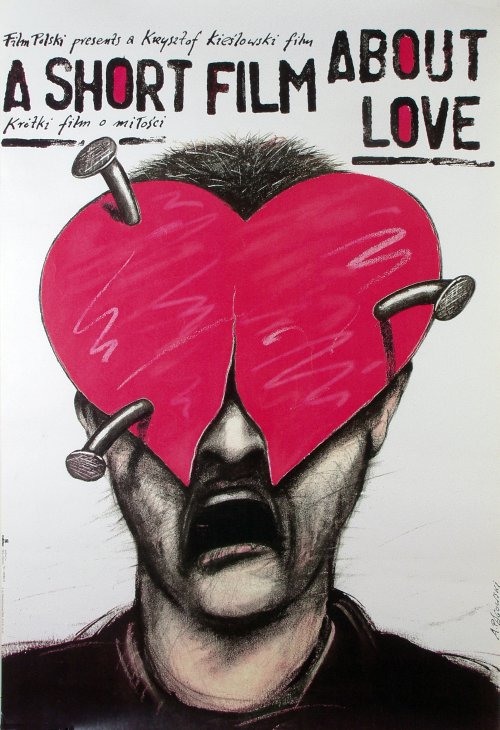
The drawing makes the target audience of teenage girls to middle aged woman curious into who is behind the heart, therefore intriguing them into watching the film so that they can find out the answer to the mystery. As well as love overall is shown to be something significant, overpowering and fantastic however in this film poster it is presented to have destroyed the protagonist, therefore inducing the audience again as they will want to know what has made him distraught from love. The typography itself is quite interesting as it looks handwritten therefore gives off the impression that it is a personal story however the handwritten writing above and below the film title are quite hard to read therefore become irrelevant to the audience as if it is hard to read they won't bother to try and work it out.
The Lost Purge (Short Film)
This film poster does seem to look quite professional and displayed out in a correct manor as it just seems to look like the producer has tried to make the film look better than it is to draw in their audience as they have put two of the awards that the film was given. However, the typography fits into the genre that the producer is trying to produce therefore makes the film poster seem more interesting. Finally the main picture of the film poster does not seem to tell part of the story or give away anything about what the film could be about therefore the audience are not as indulged into wanting to see the film as they would if they were too see another film poster with what would seem more of a story behind it, however the only message that the audience can get from this film poster is that it is about a young boy. I would say that the target audience of this film would be teenagers to young adults due to it looks like some sort of thriller.


Insomniacs (Short Film)

The typography and the design set out looks professional due to it looks like what a feature film poster would look like thus making it appealing however what seems to be lighting that is over the top of them at the top of the film poster (yellow circles) this is usually used at the start of feature films on screen however on a film poster it just looks like the print hasn't come out well or that they edited the poster badly. However the image presented on the poster fits in well with the film title therefore gives their audience an insight to that the film title is not completely off topic to what the film is about.
Best Man Wins (Short Film)
The plane that flys over the typography connotes that the main protagonists life will improve throughout the film due to it flying upwards not crashing this then links to the film title as the 'best man wins'.  It then looks like the survival of the fittest wins as there is two men having a fight in the kitchen. The typography itself seems quite professional, however the movie title seems to take up most of the film poster which can seem as if the producer did not what else to put there, resulting in it looking unprofessional.
The Longest Daycare (Short Film)
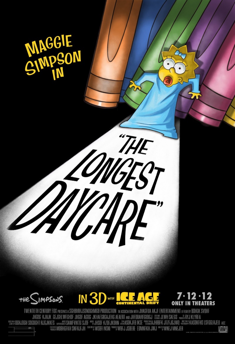
Due to Maggie being a baby you would expect Marge to be on the film poster along with Maggie however due to Maggie being the Protagonist in the film the producer must have thought just to focus on the protagonist of the film to then draw in the audience, as well as the fact that The Simpsons is a very well known and loved show so therefore the characters are much loved along with it therefore for the producer to present one of the characters to be in trouble, especially one of the most vulnerable it automatically draws in the audience due to them wanting to find out the outcome. The way in which the producer presents danger towards Maggie on the film poster in by presenting her as if she is in a horror film, high key lighting to show that she is scared/in shock then low key lighting to hide out everything around her thus creating a sinister atmosphere. The typography is the typical 'The Simpsons' typography that they use on every show which is then recognisable to the audience so that they know it is an official advert not an amateur film.
2:AM (Short Film)
The title itself sets the tone of the film because of the vibrant colours and bold typography. This further sets an time and place for the film to take place. This then allows for the audience to understand that time is a key aspect in the film because of both the title and the image below it. The use of colour makes the film poster attratvie and bold while the time frame. The set is based in a retro diner which is further supported by the title as it is neon and fits into the theme of a diner. The slogan presented next to the protagonist creates mystery and then draws in the reader as it is quite a catchy slogan due to it leaves the audience questioning itself.
Mr Hublot (Short Film)
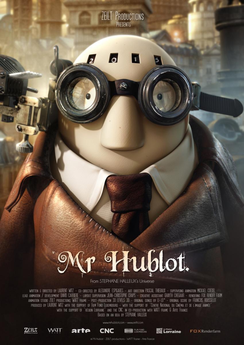
The typography that has been used for the movie title creates the sense of mystery due to it is not a typical type of typography and is used on other myserious and fantasy films such as nanny mchpee. The main character is also presented on the film poster which then connects the audience to the story automatically as the character is presented to be for children therefore he seems cute and adorable to the adult audience which then makes the adult audience want to go and see it due to them having a connection of finding the protagonist sweet and adorable.


Pokemon the movie 2000 (Film)

The target audience for this film poster would be children to teenagers. What makes this film poster so effective and persuasive to watch the film is that it is one of the small amount of posters that i have analysed that includes a slogan, this therefore catches onto the reader and makes the film stick into their head so that they can then look forward and cannot wait to see the film. As well as, they have included most of the characters that are going to be in the film on the poster this means that the audience can see if their favourite character is in it which would then persuade the audience to see it even more.
The Iron Giant (Film)
The typography is not an original type therefore creates originality to the film as well as the giant is hidden in the a of giant which further links the character to the title. Although he is presented to be a huge giant and take up most of the space on the film poster he is in a caring position of looking after the little boy which then subverts the conventions of a stereotypical giant to destroy the world. The use of the colour blue then connotes to the audience that he is not from earth as both the sky and the character are blue this is then further supported by the typography being blue.

The Naughty Room (Film)
Two scenes from the film have been introduced on the film poster which then gives the audience an insight to what the film is about. The high angle used on the bottom scene presents venerability which is then connoted to their slogan as he is about to experience one of the circumstances for whatever reason he needs to. The colour of the typography is quite bright and colourful which then connotes to the audience that the film isn't completely serious and that the genre is a comedy as well as the scenes presented from the film look quite funny and comedy like.


AS link

http://katyward26.blogspot.com/ This is my blog from AS media, i hope that this year i improve the skills that i have already achieved and produce a short film that meets the standard of A2 level media or possibly even higher.

Monday 21 September 2015

Analysis Of Brain Divided

Brain Divided
Produced by Josiah Haworth

It begins with showing the typical who produced it, it then comes in with a good idea for typography where the menu has the film name written on it, it then pans over to the right where you see a man sitting on a dinner table by himself patiently and anxiously waiting for someone to join him as there is another seat placed at the table. You can tell that the persona is anxious due to a medium shot being used to show his facial expressions of being unsure and him twiddling his thumbs probably due to boredom, he then sighs and rests his head in his hand which then shows his patience is beginning to wear thin. He then tries to keep himself amused by playing with the cutlery and then it zooms into his eye then goes through his iris into his brain where you see a blue character controlling what he is doing. The colour blue connotes to the audience that this is the calm, tranquil side of his brain as blue is associated with peace and tranquility, as well as in the background you can see the divided line where there is also a red side therefore the red side is the opposite to the blue as the colour red is associated with anger and frustration or love and passion therefore leaves the audience anticipating what is to come. It then shows the red side sleeping on a hammock and begins to start dreaming where it starts kissing and cuddling the air as well as there are romantic and appealing pictures girls shown in the background.

He then falls from his daydream and then blue side sighs and rolls his eyes it then goes back to the persona himself where his date has arrived and his face looks somewhat in shock that she has shown up. Male gaze is then introduced as the camera tilts up from her feet where you see the woman's legs going up to a tight fitted dress then up to a press face where she then flicks her hair and keeps her body language quite tight which connotes that she is quite timid and shy, followed along by an awkward looking smile. She also has bright green eyes, green is usually associated with envy so therefore it can be implied that the woman persona could be quite an envious and jealous character. It then cuts back to the blue side looking happy that things are going well then the red side realises what is going on and automatically falls in love with what he see's, the blue side then shows some sort of panic, however carries on to control the human to greet the woman that he is on a date with but carries on to watch what the red side is about to do, it cuts back to her greeting him back and then cutting back to the red side beginning to take control of the situation as he pushes the blue side out of the way of control. The red then makes the persona to make extreme movements that would be considered to be 'cringe worthy' where he takes off his glasses and pulls the woman closer and then kisses her hand as if he was about to dance with her which she responds with an awkward shy smile, he then gets over carried away and starts to kiss up her arm where she begins to look as if she is beginning to get a bit weirded out. The blue then panics as he realises how bad the situation is going and takes control of the brain back where he automatically gets straight off the woman and puts his glasses back on with the expression of embarrassment on his face and then quickly moves to offer her to sit down as he pulls her seat out and waits for her to sit down she then begins to look a lot more comfortable.

It then shows the blue side deciding what he is going to converse with the woman and then cuts to him sitting down and speaking the words the blue is commanding him to say which the woman looks highly happy with and is conversing back very happily, it then cuts back to the blue side sitting contently at the control desk as things are going well. The red then sneaks up on the blue and takes control again and makes the man seems extremely arrogant and pretentious where the woman giggles and becomes shy again, you then see the change in his face where the blue takes control as his eyes cross over and he puts his glasses back on, the glasses then begin to become a signifier of the change in character of the male persona. They both then carry onto fight for control of the brain and the date scenario, until the red has full control and takes it too far to the point where he is about to supposedly romantically kiss her, where she responds by rolling her eyes slapping him and getting away from him and begins to show anger as she clenches her hands and her face begins to get scrunched up, then storms out the restaurant. It then shows through the door his reaction to this of somewhat panic and despair, it then cuts to the brain where an alarm has began to start going off and the red side starts to panic himself as he grabs his face and his eyes frantically move, he then turns to the blue side in desperation and the blue side is looking for his glasses as the red punched him and made him loose them, the red then runs over finds them and puts them back on his face in desperation of him to sort out the mess that he has just made of the scenario. The blue then immediately responds and quickly acts upon the situation, where the man runs after the woman called Scarlett, which she reacts still in anger and frustration, the blue and red then decide that if they work together that they will be able to sort out the situation which works as the both the persona's end up kissing and Scarlett accepts it and kisses the male persona back. It then cuts into her brain where there are two typically girly persona's screaming with excitement over what has just happened, one of them is pink and one of them is purple which are stereotypical colours for girls, however they are also very similar compared to the red and the blue which presents the women brain to be less contradictory and more simplistic. She then begins to get carried away with the situation as her face quickly changes and begins to become what we be seen to the audience as 'psycho' as she straight away asks him to marry and have children, the male brain then panics and presses the avoid button,  it then leaves the audience into what happens next as that is where the story ends.


Overall, the animation and the idea of this film was great and very well thought out. As well as, it is highly evident that it is a more professional film then an amateur film.

Analysis of Partly Cloudy

Partly Cloudy
Produced by Pixar

An animated short film about birds that deliver whatever their chosen cloud makes for them to give to people on earth, however as most of the fluffy nice cloud produce cute things such as puppies and kittens the most beaten up bird has to deliver from a sad cloud that often produces not the best or safest of animals. In the beginning a tracking shot is used to follow the birds to show where they deliver the parcels; the first place in which the clip cuts to is delivering a baby to a woman's window it then cuts to two kittens being delivered to a cat flap, then to two puppies at a kennel of an older dog this then presents that the birds are delivering parcels for the good and not the bad as well as it gives the audience and overall brief to what the short film is going to be about. It then carries on to use a tracking shot to follow a group of peck's as it is then leading the audience to where the presents come from in the first place which is up from the clouds, as it shows each peck going back to its beloved cloud.

It then uses a medium shot to present all the happy clouds laughing together then pans down to the unhappy cloud where he is alone and underneath everyone else, however is still presented to be happy as he is smiling whilst making his new creation, even though it still comes out as something bad he is still shown to be happy as it is his own creation and tried to teach it to behave. His own peck then returns however his peck isn't in as good condition as the other pecks due to most of the parcels he has to deliver try to destroy him as is shown throughout the clip, however he still always returns to Gus the grumpy cloud and when he does they show affection and love towards each other by hugging and joking about however as the clip goes on the peck is presented to start to get worn out and fed up by what he is doing.

It then cuts away to a happy cloud as this is supposed to shown the perspective of what the Peck and Gus are looking at as it shows the happy cloud producing something cute and harmful, it then cuts back to them both and Gus looks at his peck in despair as Gus knows that he could be much better off with one of the other clouds however the peck still then carries on to deliver his parcels for him. It then pans up to the other clouds again therefore connoting to the audience that something is going to happen with the main peck and the happy clouds, the Peck then flies off to the cloud that he keeps looking over at then a gliding motion to a low angle is used to show the build up of Gus's anger as he begins to produce lightning, a close up is then used to show the emotions of his face, then a medium shot is used to present the Peck and his new clouds reaction to when Gus starts producing rain (crying) as they look over in shock, the peck then flies over with a parcel in which he has just received from the happy cloud, a feather then flies over his face which is a signifier of the Peck himself therefore presents the arrival of his return, he then opens the parcel and the audience see that he has got protective gear so that he can no longer get hurt by the parcels that Gus produces.

I thought that this was a very good animation as the idea of the film then produces a comforting message to the audience about how friends should never give up with each other they should persevere and try and help one another and comes across as very professional produced.

Analysis of Feast

Feast (2014)
Produced by Disney

An animated film about a stray dog that gets re-homed however starts to become at home too fast and is presented to be no longer 'loved' as instead of food that seems to be a treat, gets given Brussel sprouts and other vegetables which the dog then refuses to eat.

Medium shots are used throughout the film to start to build a view of the character on scene as if you were to use a close up you would not be able to see all the actions that the persona is making which is highly important due to his actions build on his character. This is shown by when he is getting what he wants he is jumping and running around the house however as things start not to go his way he scowls and becomes a lot less of a cheerful character as he starts to throw the food about instead, although this somehow makes the audience still feel sorry for him even though it is being portrayed that he is spoilt and has become too used to the lavish lifestyle straight away from being on the streets.

As the film goes on in the background of one scene you see the happy couple dancing behind the dog, this could connote that now the couple are to what could be seen as their 'honeymoon' stage that their focus on their pet is beginning to become distant as the lighting in the scene is also used to show this as the couple are in high key lighting and the dog is in low key lighting presenting that he is now out of their focus. Then one night then man comes down at night and opens the fridge to bring out junk food to share with his beloved pet as his relationship has gone down hill, the fridge then gives off high key lighting to the dog therefore presenting that things are going to become good for him again which in fact they do, he starts beginning to be given good that he was being given before however as the dog and his owner share a spaghetti bolognese the cress becomes a symbolic signifier of a new relationship. As the dog realises what he can do with the cress and runs away to what he knows could be a good relationship for his owner and lures him to her with the cress, which in the outcome works as they go on to get married and be happy all together, no one gets left behind or in the dark therefore leaving a positive ending/meaning to the film.

Therefore, leaving the ending to be a happy and positive message it leaves the audience to be open as children as well as adults and teenagers can watch it. As well as, it is a very professional looking animation.

Tuesday 8 September 2015

Why did i choose a short story for my brief?

At first when i was first given this task i decided i wanted to produce an advert as i thought it was the brief that appealed most to me and would interest me the most however as i began to research more into the brief the more i found it was not the best brief for me to produce as i was loosing lack of interest very fast therefore my final product would not be as great as something i had enjoyed looking into. Therefore the next brief that then seemed more practical and interesting to look into was short films as they show and explain stories to an audience in a different concept as to how films would present a story. Although it can be argued that i could of presented and done this through doing an advert due to most adverts tell a story so that it stays in the audience's head such as the John Lewis adverts are famous for their Christmas adverts as they produce a different plot to the story each year as well as Coca Cola, however i wanted to produce something that was merely based on a story that would intrigue the audience and then the outcome to be based on the story not to end with a random product. At first I started looking into documentary types of short films and thought that i was convinced with this genre however as i began to delve more into the genre i realized that there was not much that i could work with and I know what skills I have so therefore I knew i could not work with animation as i do not know how to use the software to produce an animation this then led me to making my own narrative short film. I now just need to work out what type of narrative I want to produce and then build an original story that will be induce my audience into wanting to watch it.